Law Firm Rebrand
Elevating Market Position After Structural Change
“The process was straightforward and seamless. The Red Seal Design team understood exactly what we were trying to communicate and delivered a brand that reflects the level of firm we are today.”
– Robert J. Tomei, Jr., Partner at Johnston, Tomei & Goldberg
Overview
Following the transition from four partners to three, this Chicago-area law firm reached an inflection point.
The firm had evolved. The brand had not.
The previous identity lacked the authority and cohesion required to reflect their level of expertise and the caliber of matters they handle. They were ready for a more refined presence. One that communicated strength, stability, and upper-tier positioning without excess.
This was a strategic repositioning, not a cosmetic update.
Objective
Develop a brand identity that:
Reflects a high-level, established legal practice
Communicates confidence in any professional setting
Visually reinforces unity among partners
Provides a lasting foundation for future growth
Strategy
We focused on clarity, proportion, and architectural structure.
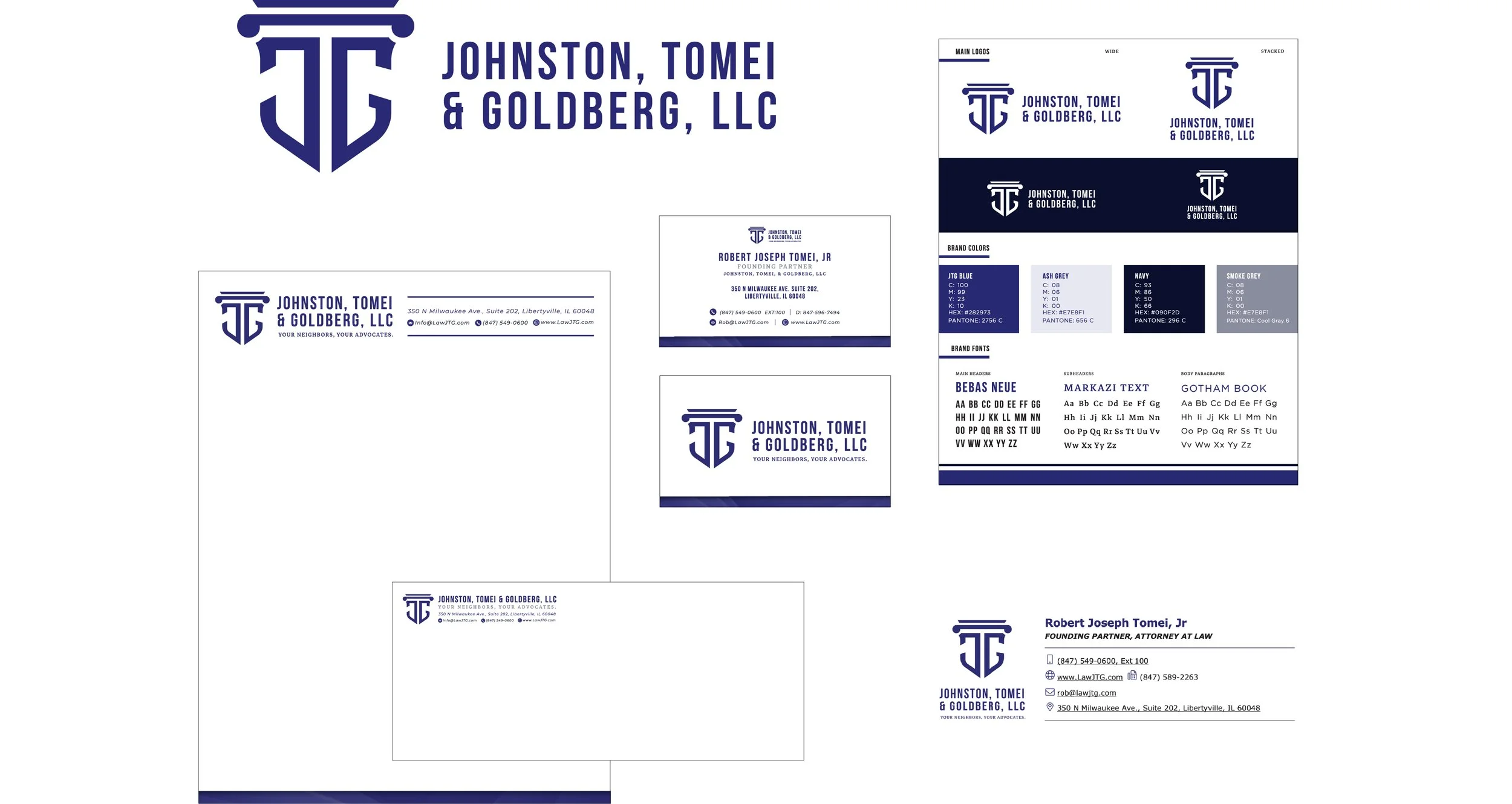
The firm’s initials were integrated into a unified mark, creating visual cohesion and symbolic strength. Typography and spacing were refined to signal permanence and credibility. The direction avoided trend-driven styling in favor of restraint and longevity.
The first strategic concept presented aligned precisely with the firm’s vision and ultimately became the final identity. Clear positioning at the outset led to confident decisions and a streamlined process.
Outcome
The result is a disciplined, elevated brand presence that aligns with the firm’s stature and ambition.
Greater perceived authority
Stronger differentiation within the local market
A cohesive visual system for print and digital
A brand foundation supporting their website relaunch
The new identity now anchors the firm’s next chapter and reinforces the level at which they operate.